
Accessibility Design
Enhancing Accessibility in Wikipedia’s Discovery Experience
Evaluating Explore & Discovery Pages after the iOS 26 update
My Role
Product Designer & Accessibility Researcher
Team
Mengqi Cao
Archishman Durbha
Kshitija Chandra
Arsh Kaushik
Duration
4 weeks
OVERVIEW
Accessibility issues grew as Wikipedia adopted iOS 26 and Liquid Glass
Wikipedia is built on a simple idea: knowledge should be accessible to everyone.
As the Wikipedia iOS app adopted iOS 26 and its new Liquid Glass interface system, Wikimedia began receiving growing feedback around usability and accessibility. The concern wasn’t only whether the new visual language looked different—it was whether discovery experiences still worked for people using accessibility tools.
Our team partnered with Wikimedia to evaluate accessibility across discovery-related experiences and identify where the app succeeded, where it broke down, and how it could better support users with different abilities
Over the course of the project, we conducted accessibility audits across VoiceOver, visual hierarchy, and Dynamic Type, uncovered 80+ issues, and synthesized them into 5 major findings and recommendations.
CHALLENGE
Discovery experiences became harder to evaluate as accessibility concerns expanded beyond reading
Wikipedia’s mission is “knowledge for everyone.” But accessibility isn’t only about reaching articles. Users first need to find, return to, and orient themselves inside information.
After the iOS 26 update introduced Liquid Glass patterns, Wikimedia wanted to understand:
How well does the app support accessibility across real discovery behaviors?
How does Liquid Glass affect readability and hierarchy?
Are iOS accessibility features properly supported?
What barriers appear when users browse over time?
SCOPE
We evaluated discovery experiences across four major surfaces

CHALLENGE
We shifted from screen-based evaluation to user-centered accessibility testing
Rather than auditing interfaces in isolation, we grounded our review around users who experience discovery differently.
Amanda:
Cognitive + Visual Disabilities
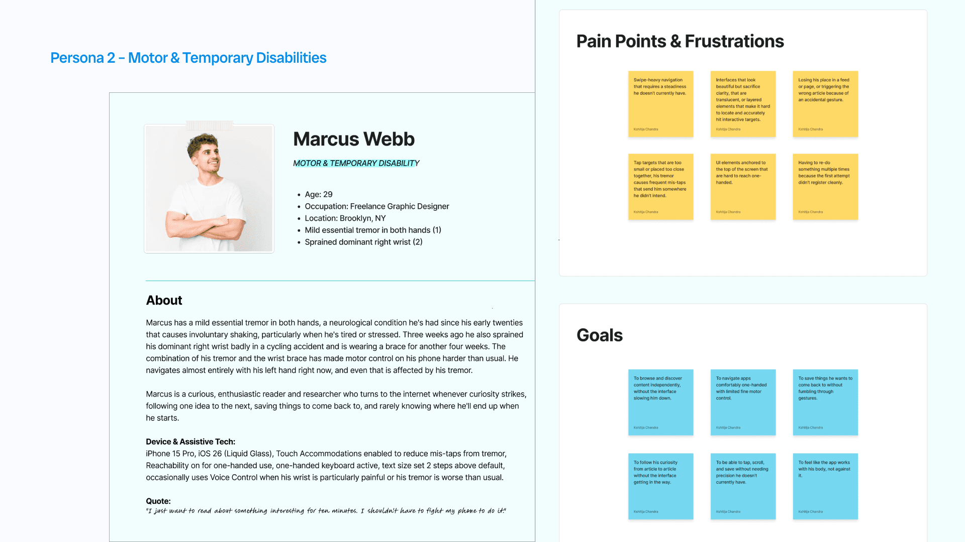
Marcus:
Motor + Temporary Disabilities

METHOD
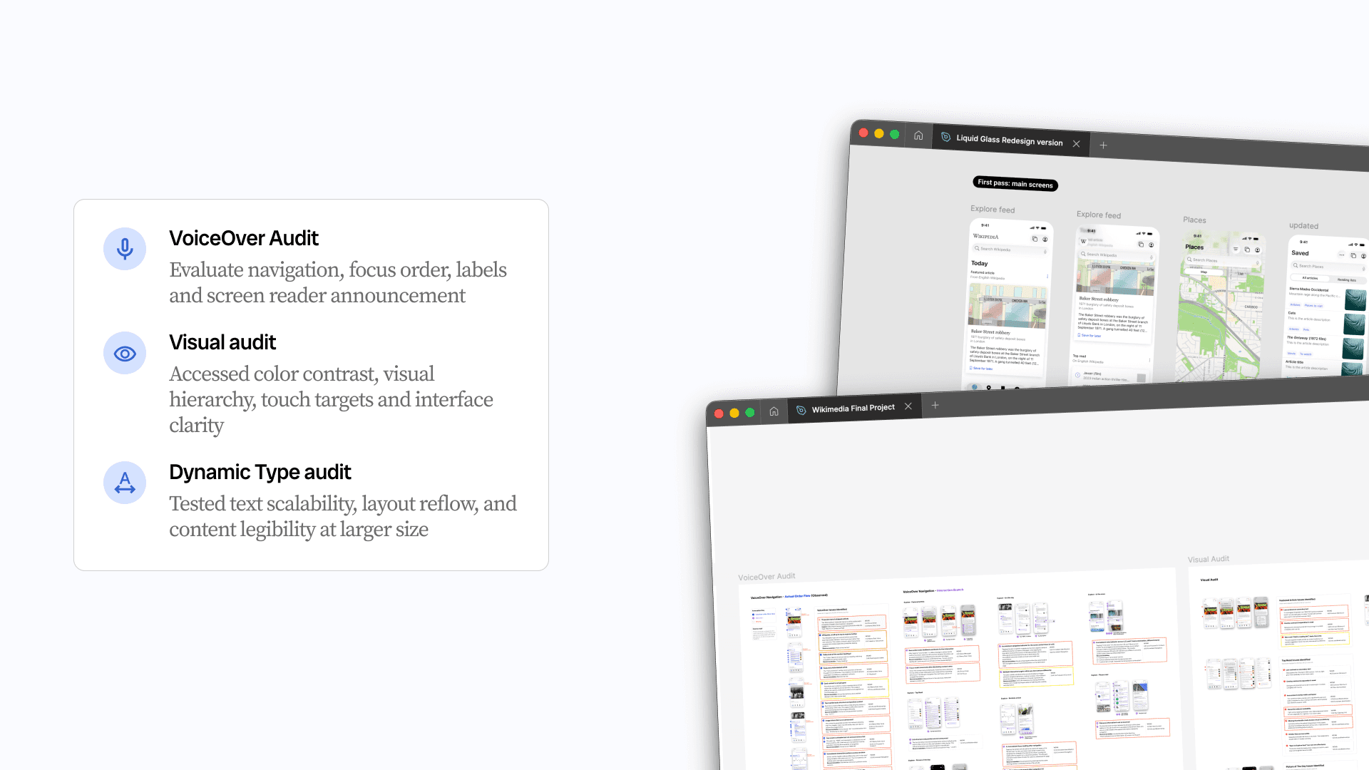
Accessibility audit methods were shaped by how our personas experience discovery
We mapped our methods to the challenges faced by Amanda and Marcus. We focused on the moments where they would struggle most while exploring content, returning to information, and navigating the app.
SEVERITY TABLE
The audit revealed over 80 accessibility issues across discovery experiences
After completing the VoiceOver, visual, and Dynamic Type audits, we documented over 80 accessibility issues across Explore, Places, Saved, Activity, and Search experiences.
Since not all issues carry the same impact, we grouped findings into three severity levels to help the Wikimedia team prioritize improvements based on user impact, accessibility risk, and implementation effort.
Critical: High-impact issues that block access, break navigation, or prevent users from completing tasks. These findings often violate WCAG requirements and directly affect assistive technology users.
Medium-term: Issues that reduce usability, efficiency, or comprehension but still allow task completion.
Long-term: Lower-severity opportunities focused on improving clarity, discoverability, and overall experience quality.

Issues & Findings
Not all findings were isolated UI issues, some revealed larger experience patterns
During the review, one finding stood out. The Explore experience revealed a broader navigation challenge that grew as content accumulated over time.
I’ll start with this finding first before moving into the smaller VoiceOver and visual issues later.
Issues
The Explore feed became harder to navigate as daily content accumulated
The Explore experience is designed around daily recommendations. Every day, Wikipedia adds new content groups to the top of the feed, including Featured Articles, Top Read, Picture of the Day, Random Articles, and more.
This structure supports discovery and creates a feeling of continuous exploration.
However, during the audit we found that as the feed grows over time, accessibility challenges begin growing alongside it.
Instead of behaving like separate sessions, previous days accumulate into one long continuous experience, making navigation increasingly difficult.
Loss of orientation
Because there is little separation between daily sections, users gradually lose awareness of where they are in the feed.
Loss of continuity
When users leave the app and return later, there is no clear re-entry point or memory of where exploration stopped.
Navigation fatigue
Revisiting previous days requires scrolling through all newer content first. As content accumulates, the physical effort grows as well.

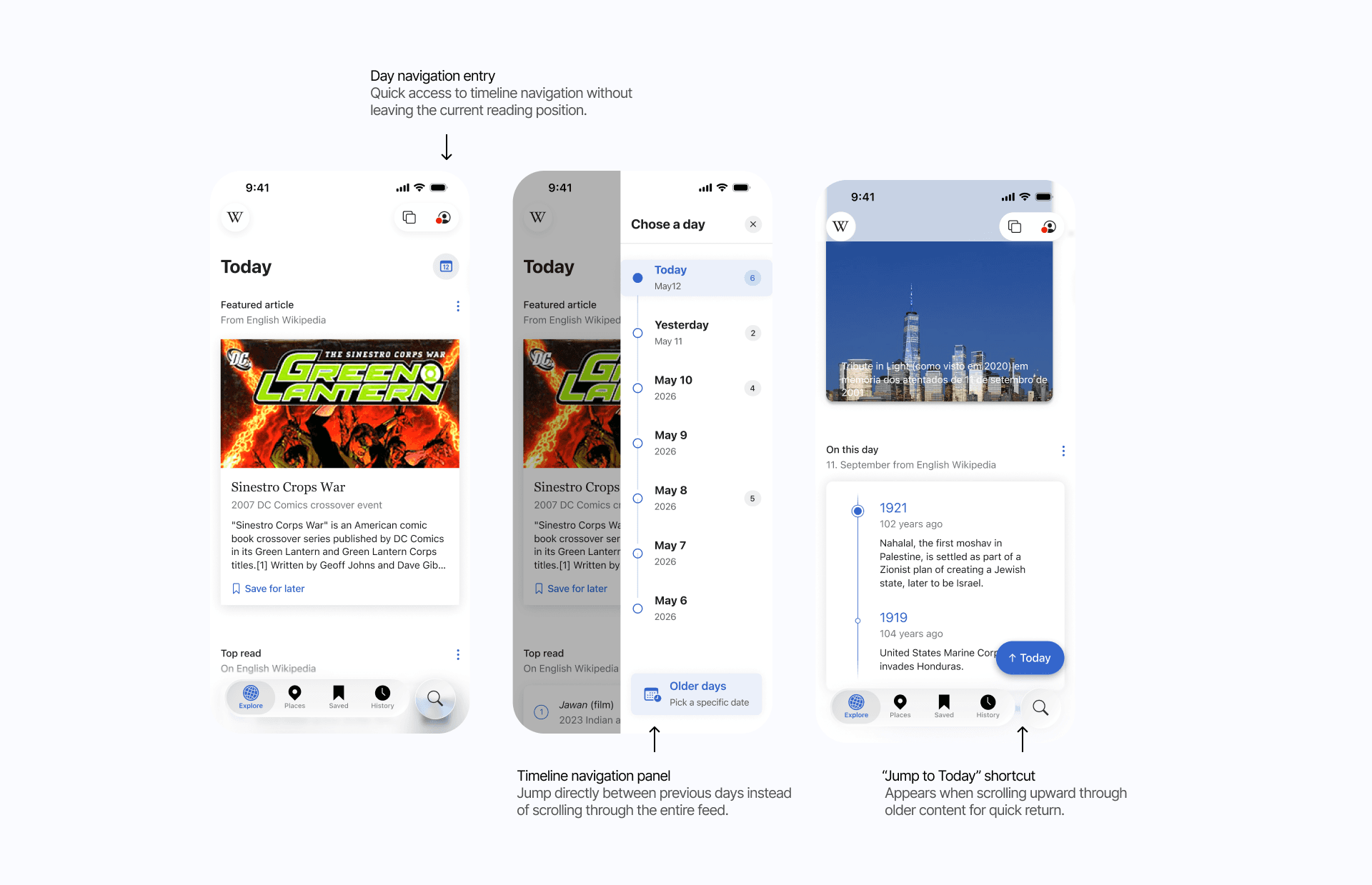
Recommendation
Supporting navigation between days without changing Explore’s discovery model
Rather than redesigning how Explore works, I focused on preserving its sense of discovery while reducing the effort required to move through growing content over time.
The goal was to make the experience feel more:
Navigable — helping users move intentionally between days
Resumable — supporting recovery after interruptions
Orientation-friendly — helping users understand where they are in the feed
Demo Video
Issues & Findings
Additionally, smaller accessibility gaps created friction across interactions
Beyond the navigation issues in Explore, the audit uncovered several smaller but recurring accessibility problems across VoiceOver and visual experiences.
VoiceOver gaps reduced access to key actions
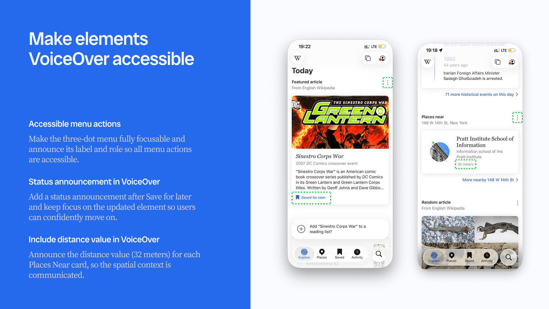
Some interactive elements were skipped entirely by VoiceOver, including overflow menus and contextual actions. In other cases, important information such as status updates (“Save for later”) and distance metadata in Places was not announced, limiting users’ ability to understand actions and spatial context.
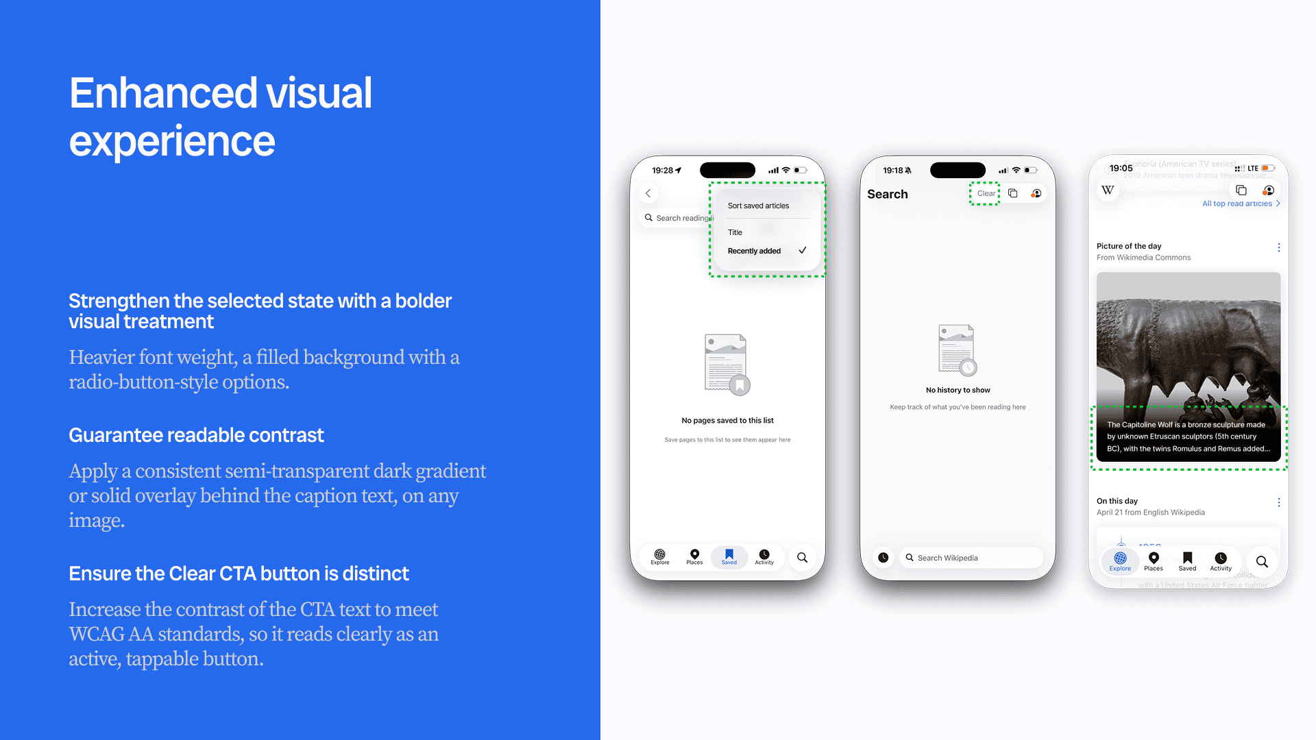
Visual hierarchy and contrast reduced clarity
Several interfaces relied on subtle visual treatments that weakened readability and state recognition. Examples included low-contrast captions over images, unclear active states in sorting menus, and actions whose contrast made them difficult to distinguish.
Recommendations focused on improving clarity and feedback. Recommendations centered on:
Making all actions fully focusable and announced in VoiceOver
Adding status feedback and contextual metadata
Strengthening selected states and interaction hierarchy
Increasing contrast and applying consistent overlays for readability
These changes were smaller in scope than the Explore redesign, but together helped improve discoverability, confidence, and accessibility consistency across the app.
CONCLUSION
Accessibility is not only about compliance, it shapes how people discover information
Through this project, I learned that accessibility issues rarely exist in isolation. Small gaps in focus order, feedback, hierarchy, or readability can accumulate into much larger usability problems.
Working on the Explore experience pushed me to think beyond UI fixes and look at accessibility from a systems perspective — how information is organized, how users maintain context, and how people recover when interrupted.
The final audit uncovered 80+ issues and produced prioritized recommendations across VoiceOver, visual accessibility, Dynamic Type, and navigation patterns. More importantly, it showed how accessibility improvements can support not only users with disabilities, but anyone navigating complex information spaces.
For me, this project became an exercise in turning accessibility findings into clearer, more inclusive product experiences.
More Case Studies


